SaaS dashboard
Orbit Analytics
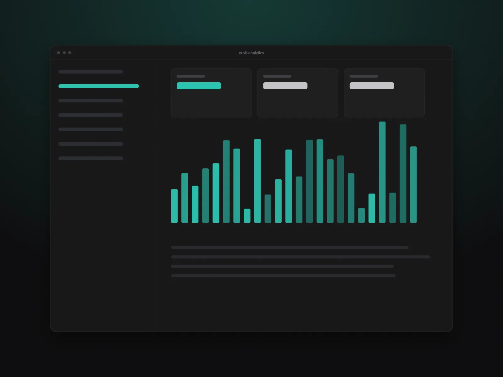
A real-time analytics dashboard that turned a spreadsheet-driven reporting process into a self-serve product for 3,000 teams.
3.2s → 0.6s
Median report load
+41%
Weekly active teams
99.97%
Uptime in year one
The challenge
Orbit’s customers exported data to spreadsheets to build their weekly reports. It was slow, error-prone and the support team spent most of its week explaining why two numbers did not match.
The existing dashboard queried the primary database directly, so heavy reports slowed down everything else.
The approach
We separated reads from writes with a pre-aggregated reporting layer, cached the hottest queries in Redis and streamed results to the browser so charts render while data is still arriving.
On the front end I built a small chart system on top of SVG with keyboard navigation and screen-reader summaries, then shipped it behind feature flags to ten pilot customers before general release.
The outcome
Median report load time fell from over three seconds to well under one. Support tickets about mismatched numbers dropped by two thirds within a quarter, and weekly active teams grew by 41%.
Sample case study written for this template. Clients, products and figures are fictional.
Next project
Fieldnote